
Webstop
Webstop creates powerful end-to-end solutions like custom websites, mobile apps, digital circulars, eCommerce features, personalized shopping lists, and paperless coupons, delivering a unique and relevant experience into the hands of shoppers.
Project Background
Webstop's Weekly Ad and Store Locator modules were due for an upgrade. They tapped me to rethink the UI an and give it a visual refresh.
Problem Space
The existing Weekly Ad feature was difficult to navigate between pages and grocery departments and was visually outdated.
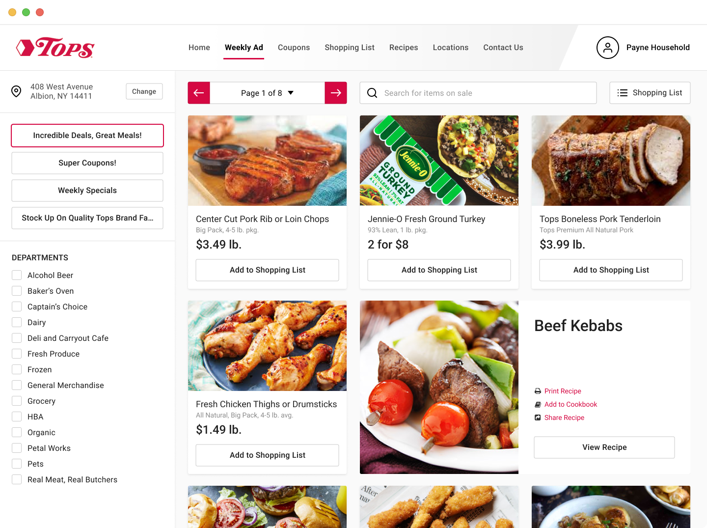
Users can easily switch between ad sections, departments, and pages and add items to a shopping list.
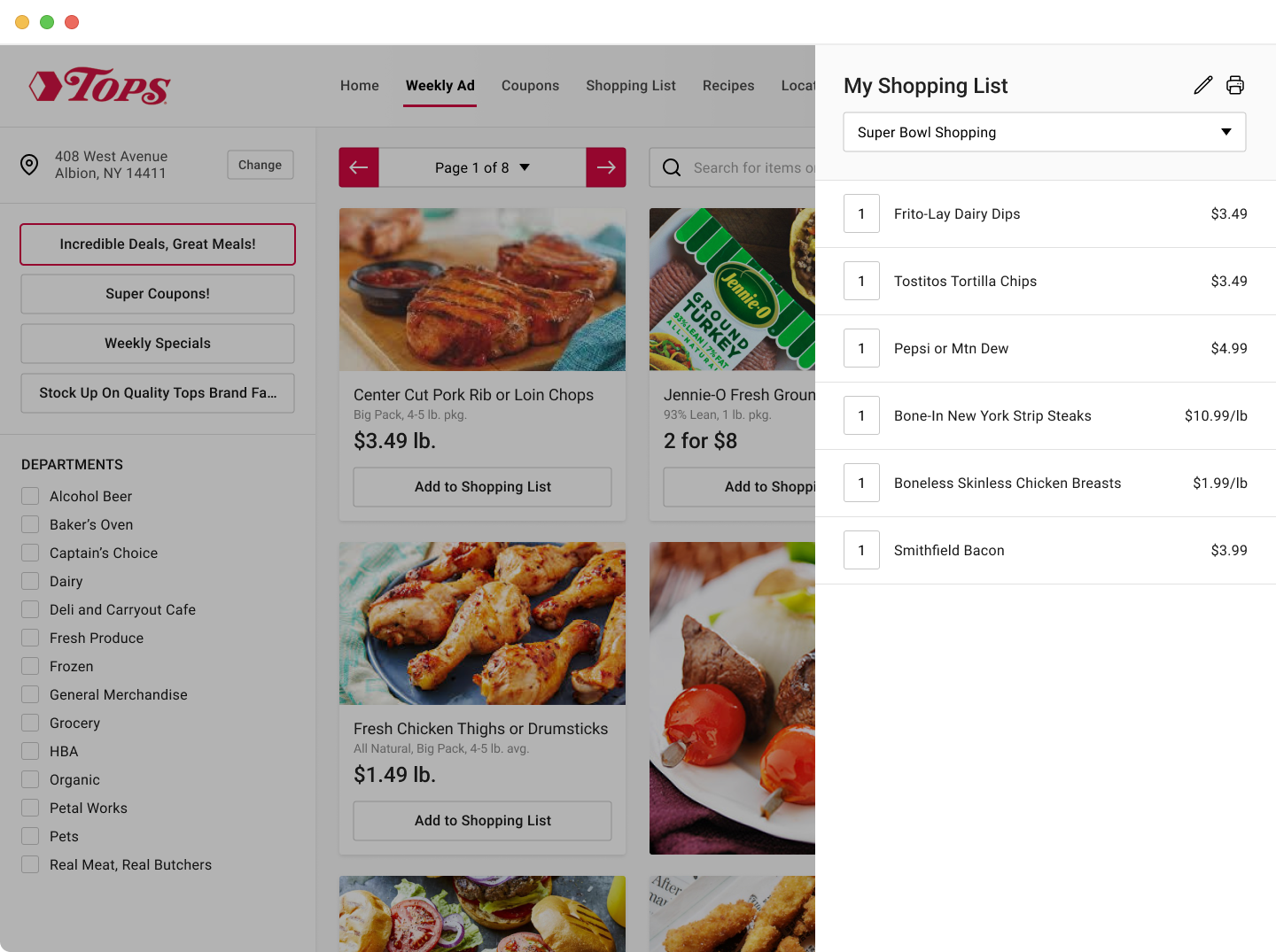
The shopping list is easily accessible and can be updated on the fly.
Process
Without access to users, my first step was to complete a heuristic evaluation. This allowed me to identify potential usability issues and prioritize improvements. Next, I reviewed user feedback from the current product and identified several areas of opportunity.
Solution
I designed an interface that made search and browsing by department a core feature of the product. I also replaced the pagination pattern with a more condensed arrow and dropdown component allowing for easier page navigation in addition to giving the whole feature a visual refresh.
Results
Customer feedback from the new tool has been overwhelmingly positive. Users report that items they normally look for on sale are easier to find and that the Weekly Ad is less overwhelming as a whole.